 holly finch
 2862
2862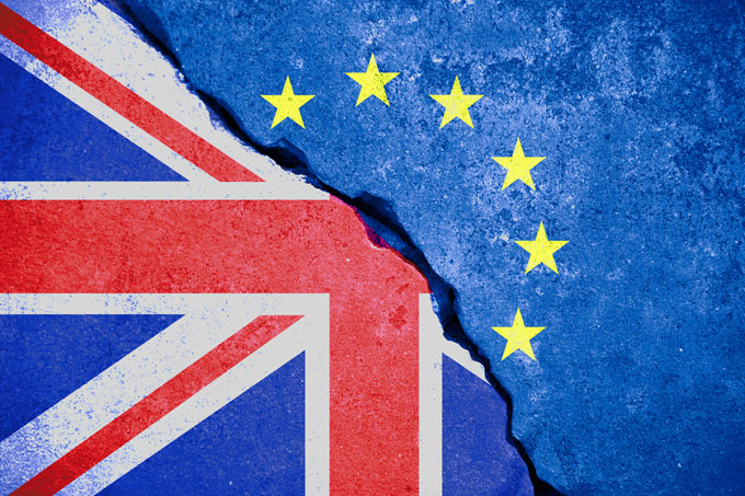
Dr Alexander Kent, Reader in Cartography and Geographic Information Science, comments on the use of maps as propaganda tools, by the Vote Leave and the Remain campaigns, in the lead up to the EU Referendum.
As Theresa May gets ready to ‘push ahead’ with Brexit after meeting with MPs at Chequers last week, will she remember seeing a propaganda map put through her letterbox before the referendum?
Maps speak to us with a language that is as political as it is aesthetic. Many have long understood – and taken advantage of – the power of maps to communicate political objectives.
In the run up to the referendum on 23rd June, official campaigns on both sides of the debate commissioned propaganda maps to persuade the electorate how to vote.
The map below was shown on the Vote Leave website and an adapted version was included in a leaflet put through letterboxes around the UK. The message from the map is clear, i.e. that remaining in the EU would make the UK especially vulnerable to an increased influx of immigrants from countries such as Syria, Iraq and Turkey.
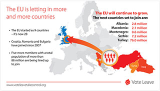
Immigration was a key theme of the Vote Leave campaign and the particular use of colour (red), the grouping of Syria and Iraq with EU candidate countries (size), and the visual nature of the arrow (impact), are all clearly intended to heighten the sense of danger to the UK and to play on the fears of the map’s intended audience. The contrast between the home countries of the migrants and their supposed destination en masse is reinforced by the colours used (reds and oranges versus blue).
The next map was commissioned by the Remain Campaign (Britain Stronger in Europe) but was ultimately rejected. In this case, a red Britain is seen riding a blue behemoth of an EU, implying that the UK is uniquely qualified to direct the EU.
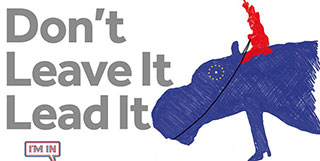
Although the tone of the map is less threatening than the Vote Leave map, it nevertheless presents a particular bias through its portrayal of the UK’s relationship with the EU by colour (red versus blue) and by anthropo-/zoomorphism (the EU as animal versus the UK as human) with Brussels as the eye of the EU behemoth. This clearly builds on the view that the UK is not only distinctive – but superior – to the rest of Europe, and, at the very least, is destined to provide a civilizing influence
We can never qualify what influence these two maps for the EU referendum had, or would have had, on the electorate, but it is clear that their creators knew how to tune into the key issues. But certainly, the latter does little to draw on the fears of the electorate, something which the ‘best’ propaganda maps have always done.
Maps have the power to change the way we think about the world, and, as these examples show, the use of cartography for political propaganda is alive and well. Whether such maps are as effective today as they have ever been is interesting to ponder; the key issue is perhaps whether the electorate actually trust such maps more or less than in the past: if maps are more ubiquitous now than ever before, are users are more or less critical of their representations?
A longer version of this article was published in The Cartographic Journal.
Dr Alexander Kent is Reader in Cartography and Geographic Information Science at Canterbury Christ Church University. He is also President of the British Cartographic Society, Editor of The Cartographic Journal and Chair of the Commission on Topographic Mapping of the International Cartographic Association.


