Dr Alexander Kent, Reader in Cartography and Geographic Information Science in the School of Human and Life Sciences, explains why himself and Christ Church colleague John Hills, Geography Technician and Research Fellow, have recently produced one of a series of posters displayed at the UN Headquarters in New York.
One year ago, world leaders met at the United Nations to adopt the 2030 Agenda for Sustainable Development and signed up to a set of 17 Sustainable Development Goals (SDGs) to end poverty, fight inequality and injustice, and tackle climate change over the next 15 years.

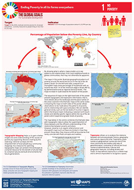
The poster produced at the University illustrates SDG 1, End poverty in all its forms everywhere, an ambitious goal and an ambitious subject to map. Using geographical information systems (GIS) and statistical data to map the population living below the poverty line of $1.25 per day, we reveal geographical patterns of poverty at global, regional and local scales, eventually focusing on the city of Rio de Janeiro, Brazil, a city known for its favelas as well as its Olympic Games.
Why use maps? Because maps are powerful tools of communication. They can change how we see the world and make us want to change what we see in the world. They can instantly reveal patterns that unsettle us and inspire action. To demonstrate this, the International Cartographic Association (ICA) asked its 27 Commissions to map the 17 Sustainable Development Goals based on the indicators associated with each goal.
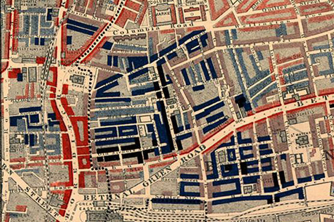
Of course, poverty is no stranger to mapping. Social reformer Charles Booth produced his famous poverty maps of London in 1889, in which he coloured streets to indicate ‘condition of the inhabitants’, with black areas denoting ‘Lowest class. Vicious, semi-criminal’ (main image, photo credit: Poverty map from Charles Booth’s “Labour and Life of the People”, Macmillan, 1889). Booth was able to show how 35% of the population were living in abject poverty, presenting this information more effectively than ever before.
Maps such as these can raise awareness by helping us to identify areas in greatest need and to make informed decisions more quickly. Poverty is an organic phenomenon and maps are limited in how they present these data as artificial boundaries rarely coincide with fluid concepts and realities, but there are always new ways that maps can be used to bring the message home.
The ICA Commission on Topographic Mapping produced the poster in collaboration with partners in the Commission for Toponymy who are based in Brazil. Other posters in the series show different perspectives towards the Sustainable Development Goals and all can be downloaded from the ICA website.
Chair of the ICA Commission on Topographic Mapping, Dr Alexander Kent is Reader in Cartography and Geographic Information Science within the School of Human and Life Sciences and President of the British Cartographic Society. He is also the Editor of The Cartographic Journal and is joined by Canterbury Christ Church University academics Professor Peter Vujakovic, Associate Editor, and Martin Davis, Editorial Assistant.
 Expert comment
 holly finch
 1991
1991


